Introduction
One of the easiest ways to misread a chart is to study only one timeframe. A stock can look powerful on the daily chart while running into major weekly resistance. It can also look weak on the daily chart while simply pulling back within a healthy weekly trend.
That is why multi-timeframe analysis matters. It helps you understand not just what price is doing, but where that move sits inside the bigger structure.
One-line summary for beginners
A short-term breakout can mean less when a longer-term resistance area is still close overhead.
Why this signal matters
This perspective keeps you from overreacting to short-term action. A strong daily candle can still be a bounce inside a larger weak structure. A rough daily pullback can still be normal behavior inside a bigger uptrend.
It also improves timing. The higher timeframe tells you the environment. The lower timeframe tells you how price is behaving inside it.
When the signal becomes more meaningful
Start with the higher timeframe first. Is the weekly chart trending higher, sitting in a major range, or still below important resistance? That gives you the larger map.
Then move to the daily chart. Is the current move aligned with the bigger trend, or is it fighting it? A daily breakout inside a strong weekly structure often deserves more respect than the same breakout directly under a major weekly ceiling.
When the timeframes disagree, do not force a simple answer. The disagreement is the message. It usually means the chart is less straightforward than it appears on one screen alone.
Visual guide
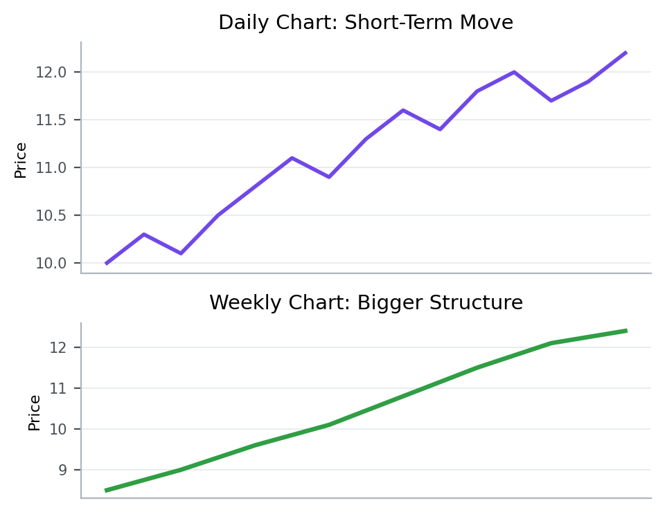
The upper panel represents the shorter timeframe and the lower panel the broader structure. The point is to see how the same move can look very different depending on the lens.
Patterns that showed up often in real data
From 2023-01-01 to 2026-03-20, the KRX, South Korea’s main stock exchange, produced the following follow-through after similar setups.
Condition: cases where the short-term signal was strong but the 60-day high was still nearby overhead
This article looks at what happened in the market after cases that matched strong short-term signals that still sat near higher-timeframe resistance.
5-day median return means the middle result after lining up all 5-day forward returns from cases that matched this setup between 2023-01-01 and 2026-03-20. For example, 5-day median return -1.1% for overall sample means the midpoint of those 5-day forward outcomes landed there. A negative value means the follow-through was weaker more often than not, while a positive value means the stock held up or advanced more often. 20-day median return is read the same way, except it tells you more about whether the move held up over a longer stretch.
Across the full sample 5-day median return -1.1%, and 20-day median return -2.8%.
Overall, this setup did not naturally lead to stronger follow-through. Both the 5-day and 20-day median outcomes were weak, and fewer than half of the cases were higher five sessions later.
That is why a good-looking short-term chart still deserves a lower confidence read when higher-timeframe resistance is close.
Key points from a recent example
A recent example is 폴라리스AI (039980) on 2026-03-13.
This example was chosen because it matched the article’s core condition: cases where the short-term signal was strong but the 60-day high was still nearby overhead. In other words, it is a recent market sample that shows how the concept looked in a real chart.
On the day itself, the stock moved 16.5%, the gap was 8.0%, the closing position was 64.0%, and turnover relative to market cap was 138.9%. On the same day, KOSDAQ, South Korea’s growth-heavy junior market, showed an advance ratio of 48.9%.
Read in the context of the 중견기업부 sector, the key is not to label the signal too quickly but to judge the close and the follow-through first. The 5-day forward return was -8.5%, and the point of the example is that a strong short-term setup still needs to be judged against the distance to higher-timeframe resistance.
That is why, when you see a similar setup again, it helps to check how strong the close was and whether the structure held over the next few sessions, not just why the stock moved that day.
Investor checklist
- Check first whether a strong daily signal is running into weekly or other higher-timeframe resistance.
- Use the shorter timeframe for execution and the longer timeframe for location.
- Do not overrate a short-term breakout when major overhead resistance is still nearby.
Common mistakes
The first mistake is trusting the lower timeframe too much. It moves faster, but it also produces more noise.
The second mistake is using the higher timeframe alone and ignoring execution context. Even a healthy weekly chart can produce messy daily entries.
The third mistake is demanding agreement at all times. Some of the most useful reads come from understanding why the timeframes disagree.
Summary
Multi-timeframe analysis gives price action depth. The higher timeframe shows structure and location. The lower timeframe shows speed and execution. Together, they tell a more complete story than either one can tell alone.
To extend this idea, read Why Understanding Market Structure Makes Charts Easier to Read and How to Read Failed Patterns and False Breakouts.