Introduction
Trend sounds simple until price starts moving quickly. A single sharp rally can look like a new uptrend. A rough pullback can feel like a breakdown. In reality, trend is less about one move and more about the sequence of highs and lows that keeps repeating over time.
The reason trend matters is that the same daily move means different things in different environments. A bounce inside a downtrend is not the same as a pullback inside an uptrend, even if both candles are green.
One-line summary for beginners
Trend is safer to read through higher lows and higher highs that keep holding than through one fast up day.
Why this signal matters
Trend gives you direction, but more importantly, it gives you context. It helps you decide whether current price action is aligned with the broader move or fighting against it.
It also keeps analysis grounded. When you know the chart is trending higher, you look at weakness differently. When you know the chart is still trending lower, you become more cautious about calling every rebound a recovery.
When the signal becomes more meaningful
An uptrend is the easiest to recognize when price keeps making higher highs and higher lows. A downtrend is the opposite: lower highs and lower lows. A range appears when price moves sideways without resolving in either direction.
Do not just count candles. Look at swing points. If recent lows keep stepping higher and buyers keep pushing beyond prior highs, the uptrend is still intact. If rebounds keep stalling at lower levels and support keeps giving way, the downtrend is still doing the work.
Ranges deserve respect too. A stock can spend weeks moving sideways while building the foundation for a later move. Until the range breaks, neither side has truly won.
Visual guide
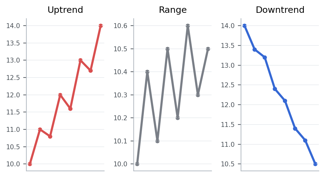
The chart highlights the simplest trend test: are highs and lows progressing upward, downward, or staying trapped inside a band? That question usually matters more than the latest candle.
Patterns that showed up often in real data
From 2023-01-01 to 2026-03-20, the KRX, South Korea’s main stock exchange, produced the following follow-through after similar setups.
Condition: cases where the 20-day average was above the 60-day average, the close stayed above the 20-day average, and both 20-day and 60-day returns were positive
This article looks at what happened in the market after cases that matched cases where the 60-day uptrend structure remained intact and price still closed above the 20-day average.
5-day median return means the middle result after lining up all 5-day forward returns from cases that matched this setup between 2023-01-01 and 2026-03-20. For example, 5-day median return -1.1% for overall sample means the midpoint of those 5-day forward outcomes landed there. A negative value means the follow-through was weaker more often than not, while a positive value means the stock held up or advanced more often. 5-day positive rate means the share of cases where the stock was actually higher five trading days later.
Across the full sample 5-day median return -1.1%, and 5-day positive rate 42.9%.
Overall, this setup did not naturally lead to stronger follow-through. Both the 5-day and 20-day median outcomes were weak, and fewer than half of the cases were higher five sessions later.
That is why trend is better judged through where the close finished and whether the structure held for a few more sessions, not through one strong daily move.
Key points from a recent example
A recent example is 성호전자 (043260) on 2026-03-13.
This example was chosen because it matched the article’s core condition: cases where the 20-day average was above the 60-day average, the close stayed above the 20-day average, and both 20-day and 60-day returns were positive. In other words, it is a recent market sample that shows how the concept looked in a real chart.
On the day itself, the stock moved 2.0%, the gap was -3.1%, the closing position was 73.3%, and turnover relative to market cap was 2.1%. On the same day, KOSDAQ, South Korea’s growth-heavy junior market, showed an advance ratio of 48.9%.
Read in the context of the 우량기업부 sector, the key is not to label the signal too quickly but to judge the close and the follow-through first. The 5-day forward return was -10.7%, and the point of the example is not to praise a sharp move but to show why you should check whether the structure had already tilted upward and whether the close stayed firm.
That is why, when you see a similar setup again, it helps to check how strong the close was and whether the structure held over the next few sessions, not just why the stock moved that day.
Investor checklist
- Check first whether the last 20 trading days still show both higher highs and higher lows.
- Judge the move by where the stock closes over the next 3 to 5 sessions, not by one sharp up day.
- See whether the stock can keep a higher low even when the broader index turns choppy.
Common mistakes
The first mistake is confusing speed with trend. A fast move is not always a lasting one.
The second mistake is declaring a reversal too early. Trend changes usually need structural evidence, not just one dramatic candle.
The third mistake is ignoring the bigger time window. A daily bounce can still sit inside a weak weekly trend.
Summary
Trend is the backbone of chart reading. Once you know whether price is trending higher, trending lower, or moving sideways, every candle and every headline becomes easier to interpret.
For the next step, read What Moving Averages Actually Tell You on a Chart and Why Volume Often Matters Before Price.